
Consistent Alignment of Text in Panels

As a Solution Builder, I often use a combination of panel types on the same model master to show different types of information about the subject element - mixing read-only and editable elements.
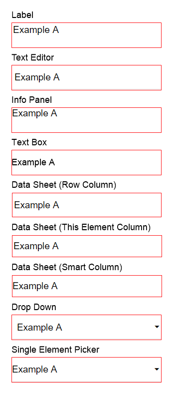
I want the text in different panel types to have the same alignment. Currently, the alignment is very inconsistent. Here are some examples:
 Here it a table to better show the inconsistencies:
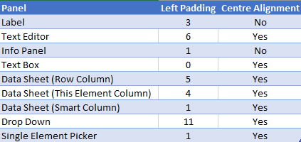
The left padding varies from 0 to 11 pixels, and vertical centering is not possible for labels and info panels, which I most frequently use to show read only information.
These inconsistencies in alignment makes a model master with several of these panels look messy/unordered.
To compensate for these inconsistencies, I often overlay two panels and offset them, so the text appears centered with a nice and even left padding. This makes is more complex the create and maintain the model master. It also makes the page slow to load, because there are more panels to load.
So, I would like the panel's text to have a consistent padding and alignment.
The benefits will be that model masters of this type will look properly ordered, it becomes easier to create and maintain them, and they will load faster.
Acceptance criteria are:
- The text in all panels (and matrices) must have the same padding, and the padding size should comply with normal best practise for graphical design (it should not be 0).
- It must be possible to vertically centre align the text in all panels. (It is already possible in matrices)
Priority is medium.
Please sign in to leave a comment.
Comments
0 comments