
A histogram groups information into ranges. In MooD, you can use Aggregation matrices alongside charts to create histograms.

Two scenarios are illustrated here. Each demonstrates a different way to use an Aggregation matrix to create the histogram. The second scenario is the more complex, as it uses queries to collate the different ranges in the histogram. This first scenario uses a Pick list to set the ranges.
Scenario 1 and its Solution

You have Project elements that include a Pick list defining status. You want to create a histogram that shows the number of Project elements with each status. This basic scenario uses a Simple count fact to count elements and a Level that groups by Pick list.
This scenario is simple to implement as it is just a count of Pick list states. Specifically, in an Aggregation matrix:
On the Source Query tab, create a query that finds the elements that you want to include in the histogram, for example, all the child projects held under an Active Projects element.
On the Designer tab, create a single Simple fact that is COUNT Source Elements.
On the Designer tab, add a Level that groups the content by the Pick list that you want to display as a histogram. In the categories of things that you can add as a Level, the Pick list will be listed on the Simple Types tab (the final tab) in the Pick Types category.
On the Designer tab, make sure that the only visible level in the aggregation level is the Pick list level. When you execute the aggregation, you should get rows for each of the Pick list states together with the number of elements that have each state.
You can now add a chart that has its Information Shown setting set to the Aggregation matrix. Note that, depending on the chart you have chosen, you may have to experiment with the Series taken from setting, for example, if using a Pie chart, set Series taken from to Columns.
Scenario 2 and its Solution
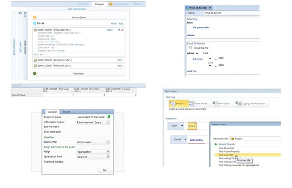
You have Project elements with a Cost value. You want to chart the number of projects that fall within three cost ranges: less than £5000, £5001 to £9999, and over £10000. This example is more complex. It uses a separate parameterized query to find the elements within each range, and then uses these queries within aggregation facts to return a count for each.
The task sequence to implement this scenario is:
Create an Aggregation matrix where the source query finds the top level Project element, for example Active Projects. This is this element that contains all the individual Project elements that you want the histogram to cover.
Create three queries to find the three ranges that you want to show on the histogram. Each query should start from the parameter, and include a Find Children block where Cost matches the required range. By starting from the parameter, when these queries are included in the Aggregation matrix facts, they will be passed the element found by the source query (in the example scenario Active Projects). Following the scenario, the three queries could be Find under 5K, Find 5K to 10K, and Find over 10K.
Back in the Aggregation matrix, create three facts SUM(COUNT(Find under 5K)), SUM(COUNT(Find 5K to 10K)), SUM(COUNT(Find over 10K)). Each fact is a Simple fact with a Query Value block. In Fact Builder, when you click to add a Query Value block, you get a Count Select Query... component. Click Select Query... to select one of your queries.
Execute the Aggregation matrix. You should get a matrix with a single row (Active Projects) and three columns (one for each fact). The numbers give you a count of the child Project elements where the Cost field satisfies the corresponding condition.
You can now add a chart that has its Information Shown setting set to the Aggregation matrix.
To read the full document, it can be accessed via the attached word document.
Comments
0 comments
Please sign in to leave a comment.