A Radial chart is a number of rings emanating in one direction from a central ring. Each ring contains one or more elements shown as nodes on the ring. Each ring is related to the previous ring by a single relationship. This relationship forms the links between nodes. For example:
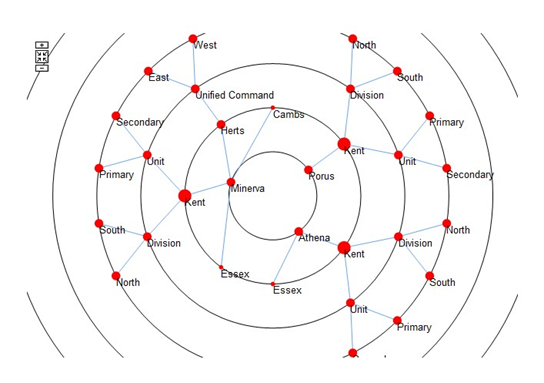
Radial charts can provide a simple overview of how elements are connected, and they can be configured in a variety of ways to help convey the complexity of interactions between elements. For example, in the image above, nodes are sized according to their number of links.
In practice, Radial charts can help you judge the complex interactions between a set of related elements. For example, the varying degree to which a business object acts as a common resource supporting the achievement of a set of business processes can be clearly represented by a Radial chart. You can quickly see how significant an object is to your processes.
Consequently, the impact of removing or investing in an object would be apparent. You create and design Radial charts in Business Architect. When deployed in Active
Enterprise, Radial charts provide additional interactivity to the user.
General features
Radial charts are composed of rings. Each ring is a group of elements. Each element appears as a node on the ring, for example:
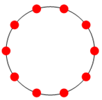
The first ring forms the centre of the chart. All other rings radiate from this first ring. When you add a Radial chart to a model, you specify the subject element and the information shown from it. This creates the first ring. In the previous image, the ring could represent the children of a subject element. You cannot delete the first ring.
Note: If the first ring is a single element, it appears as a node on its own in the centre.
It is still considered the chart’s first ring.
As you add rings to a chart, you specify how the elements in the new ring relate to the elements in the preceding ring. The chart then shows the relationships between the nodes on each ring as links.
You can emphasize the importance of particular relationships in the following ways:
- Nodes can be sized relative to an element or measure field, or to the number of links coming from the node.
- Nodes and links can be coloured based on a Pick list.
Active Enterprise features
In a browser, you can:
- Click a node’s label to go to that node or to centre the chart on that node. On the ribbon these are the Allow Node Navigation and Allow Centring settings. If only one is enabled, it is done immediately. As shown next, if both are enabled, you choose which one you want from a menu.
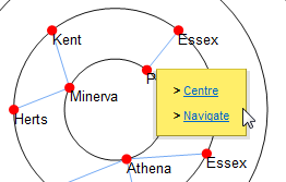
Centring can be animated (the Animate setting on the ribbon).
|
Node centring – A powerful way to drive solutions |
|
The element that a Radial chart is centred on is exposed for green pinning. Centring a Radial chart on a node (element) updates any pinned panels accordingly. This is a particularly powerful feature for solution development, as Radial charts can drive surrounding content. As a user centres a Radial chart on an element, they’ll see the pinned panels (Info panels, matrices, and charts) update to show content for that element. |
- Zoom. Use the mouse wheel or Zoom buttons to explore a chart’s rings. The ribbon includes a Reset/Zoom Button check box. The Reset button re-centres the chart on its original point.
- Pan. Click and hold on whitespace (the chart’s background colour) to then drag (pan) the chart. You can use the left or right mouse buttons.
For browsers, you can also configure:
- Link highlighting. Choose between:
- Upstream — highlight links from the selected element to the first ring. This shows the chain of relationships that placed the node on the chart.
- Downstream — highlight links from the selected element outwards to related nodes further down the relationship chain.
Highlighting is applied when the mouse pointer is over a node’s label.
- Depth settings. From the node or ring that the chart is currently centred on, you can make rings beyond a certain depth appear differently. Typically, you use this to make distant rings less prominent and help users focus on closer relationships.
Configuration features
Radial charts have additional configuration options to those outlined in the previous two sections.
From the ribbon you can:
- Set a background colour (fill), the gap between rings, the colour of rings, whether the line of the ring itself should appear, and the font properties of any text.
- Display duplicates. If set, elements that are linked to several times can have duplicate nodes on a ring. This can make the chart’s hierarchy easier to understand. The Radial chart uses its own algorithm to manage duplicate nodes.
Using the Edit Rings dialog box, you can also configure nodes and links on a per ring basis. You can:
- Set the appearance (style) of links and nodes. You can use different colours, shapes, line widths, and label formats.
- Conditionally size and colour nodes and links based on element fields. For example, you could conditionally make links red and in a thicker line.
Adding a Radial chart to a model
Adding a Radial chart is like adding any other panel. You place it onto a model, and then use its flip side and the ribbon to configure it.
Task 1 To add a Radial chart to a model:
- Open the model.
- On the Home tab, in the Insert group, click Graphs.
 A gallery opens
3.In the gallery, in the Graphs section, click Radial Chart.
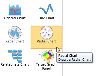
As you move the cursor over the model, Business Architect shows you that a Radial chart will be added.
- Click to add the Radial chart to the model. A Radial chart is added on its flip side.
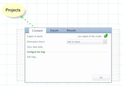
By default, the Radial chart is pinned to the model’s subject element.
- If you want to use a different subject element, pin the panel to that element. The subject element must be on the same model as the chart.
- Next to Information shown, click click to select.
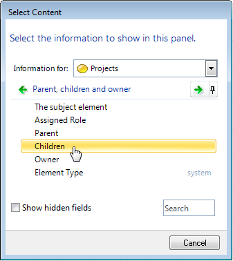
A Select Content dialog box for the subject element is displayed.
- Select the content from the subject element that will form the nodes on the chart’s first ring.
For example:
|
Setting Information shown to a query |
|
If you set Information shown to a query, an Edit this query link is added to the Content tab, and the Inputs tab will include fields for any query variables required. |
The Results tab lists the elements that will form nodes on the chart’s first ring, as shown next:
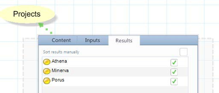
You can change the sequence of nodes on the first ring, or omit individual elements from the chart.
Note: If there is only a single element, it will appear as a node in the centre of the chart. As hiding and reordering don’t apply, single nodes are not listed on the Results tab. Instead, it appears dimmed and shows the message This tab is not supported for this panel configuration.
|
Manually adding elements |
|
This task automatically adds elements. However, you can add elements manually by selecting I want to add elements manually in the Select Content dialog box. When this is selected, the Results tab changes to include an Add button. |
Once you have content for your Radial chart’s first ring, you can add additional rings.
- On the Content tab, under Configure the rings, click Edit rings. The Edit Rings dialog box is displayed.
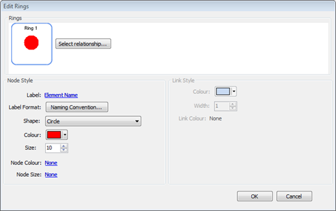
9. Under Rings, click the Select Relationship button. The Select Relationship dialog box is displayed.
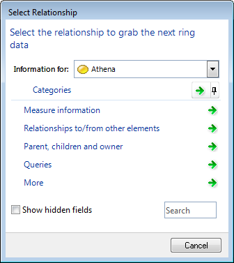
- Select the relationship between the first ring and the second ring.
The Rings group in the Edit Rings dialog box will show the new ring and its relationship to the first ring.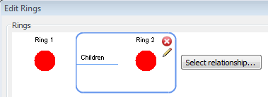
11.If required, repeat steps 9 and 10 to add more rings.
As Radial charts are a sequence of related rings, you can only delete the last ring in the chain, and you can only add new rings to the end of the sequence. You can use the button to access the Select Relationship dialog box for each ring. However, if you change an interim relationship, you should check for consequences later in the chain.
- For each ring, format the nodes and links as required.
The Edit Rings dialog box has format settings for individual rings. Under Rings, rings are numbered. The ring shown with a border indicates that the current Node Style and Link Style settings apply to that ring. Link formatting applies to links to that ring from the preceding ring (this is why the Link Style group is unavailable for the first ring.)
Individual ring settings override any corresponding chart wide settings (settings on the ribbon).
|
The Label setting and its importance for Active Enterprise |
|
Label defaults to Element Name, but you can click the link and change this to another field or measure, or to None. However, note that node navigation, chart centring, and link highlighting rely on labels being visible. |
- Once you have the rings you need, click OK to close the Edit Rings dialog box and return to the Content tab.
- On the Content tab, click OK.
The panel flips to display the Radial chart on the model.

Once you have a Radial chart, you can:
- Use the ribbon to configure chart wide settings that apply to all rings.
- Use the Edit Rings dialog box to configure individual rings. Individual ring settings override any chart wide settings.
- Pin Info panels, matrices, and Graph panels to the Radial chart so that, under Active Enterprise, they show content derived from the node that the Radial chart is currently centred on.
See the Features section (page 15) for details of the various configuration possibilities.
Testing Radial charts – web preview
Because many Radial chart features are Active Enterprise only, they are not apparent on a model displayed in Business Architect. To fully test Radial charts, on the ribbon, on the Web tab, click Preview.
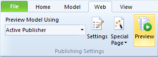
This displays the model in a browser where you can test features such as depth settings, node centring, and green pinning.
If you'd like to read more on this matter, please click the attachement.
Comments
0 comments
Please sign in to leave a comment.