MooD 15 Build 86 includes two new performance charts: Project Performance and Risk Performance.
1.1. Project Performance
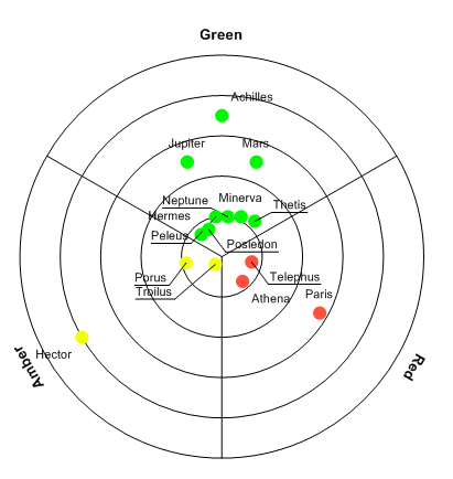
This radar style chart groups items together by category. Categories form segments on the chart. The distance of items from the centre of the chart (Y value) is set by some criteria.
Optionally, you can also control the marker colour and label content.
This chart is good for showing the status of projects. For example, show all projects’ Risk status where Risk is a Red Amber Green Pick List. This is what the image above is showing. Distance from the centre is defined by the Project Completion date. Projects nearing completion appear closer to the centre. The visualization helps users appreciate the entirety of their project portfolio, and target Red or Amber projects that are becoming time critical.
When designing these charts, you should make sure your users can understand what the distance from the centre, and if used, size and colour, represent. You can remove lines and labels to hide the segmentation, or create a single segment chart. In addition, you can use a Threshold as the chart background. The Project Performance chart is highly configurable.
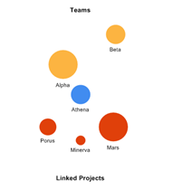
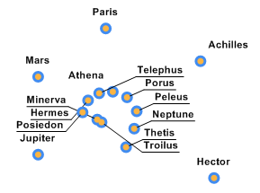
1.1.1. Introducing the Clock Face chart You may also be interested in the Clock Face chart. This plots related content on a pseudo clock face divided into any number of segments. For example, this two segment (series) chart shows the Team and Project elements associated with the central Athena Project element.
1.2. Risk Performance
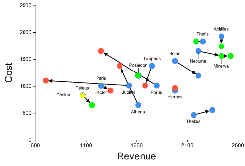
This scatter style chart shows the movement of points and their direction of travel. It plots a point at X, Y, and a connecting line showing a transition to X2, Y2.
This chart is good for presenting how some aspect of risk or performance is progressing. For example, which projects are becoming riskier? What is happening to costs and revenues? It can help users identify where interventions are required.
2. Project Performance chart
As with all charts, the Project Performance chart is available from the Graphs gallery on a model’s ribbon (the Home tab), and configuration has two stages:
- Use the panel’s flipside to specify the chart’s content and some aspects of its appearance. You can use an Aggregation matrix.
- Use the ribbon to refine the chart’s behaviour and appearance.
2.1. Flipside options – Content setup Once it is on a model, flip the Project Performance chart’s panel to configure the content it will display.
Key Points about Configuration:
Information Shown provides the elements that will be plotted on the chart. For example, it might be a query that returns all active Project elements.
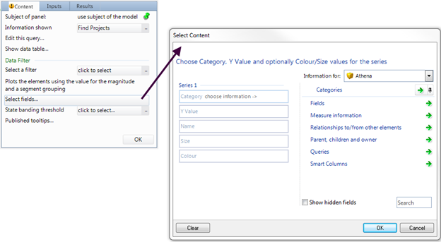
- Once Information Shown is set, click Select Fields to display the Select Content dialog box. This is where you define the categories that your chart will be divided into, and the criteria by which the elements will be positioned, sized and coloured.
o You can also open the Select Content dialog box from the chart’s ribbon. The Style tab includes a Select Fields command that is enabled when the Conditional check box is selected.
- Category. This gives you the segments in your chart. Each unique item returned by this becomes a segment in the chart. For example, if you select a Pick List with 3 picks, it will add three segments to the chart.
o You do not need to divide the chart into multiple segments. For example, if you just want a visualization of projects nearing completion, you could set Information Shown and Category to an All Live Projects query (the results set is considered one item) and then set Y Value to a Completion Date field on those projects. This could give you a chart like this:
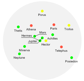
- Y Value. How the relative positioning from the centre is determined. For example, the larger the number or later the date, the further from the centre.
o Once Series 1 has values for its Category and Y Value settings, Series 2 fields are added to the dialog box. You can add as many series as you require. The Category setting in each series contributes more categories to the chart. For example, if the Category in Series 1 is a Pick List with three possible picks and Category in Series 2 is another Pick List with two possible picks, the chart will have five segments – one for each possible pick.
- Name. Optional. What to get the marker label from. For example, you could get the labels from a string field or from a string fact Smart Column. If not set, the element name is used (this is the Default check box on the ribbon’s Labels tab (you have other labelling options on this tab)).
- Size. Optional. The basis for any relative marker sizing (the ribbon’s Style tab has more sizing options).
- Colour. Optional and can be hidden depending on the Conditional check box on the ribbon’s Style tab. By default, this check box is selected and you have the Colour field. Use it to colour the markers. For example, to the colour of Pick items. In the preceding image, a Red Amber Green Pick List has been used to colour the markers.
2.1.1. Using an Aggregation matrix
If you set Information Shown to an Aggregation matrix, the source query elements will be plotted on the Project Performance chart according to this mapping:
- Category – Fact 1.
- Y Value – Fact 2.
- Name – Fact 3.
- Size – Fact 4.
- Colour – Fact 5. Use a Threshold fact.
When you set Information Shown to an Aggregation matrix, Select Fields is removed from the chart’s Content tab (flip side). To see the mappings, click Select Fields on the ribbon’s Style tab (the Conditional check box must be selected). For example:
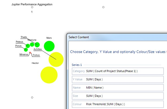
The Aggregation matrix that produced this chart looked like this:
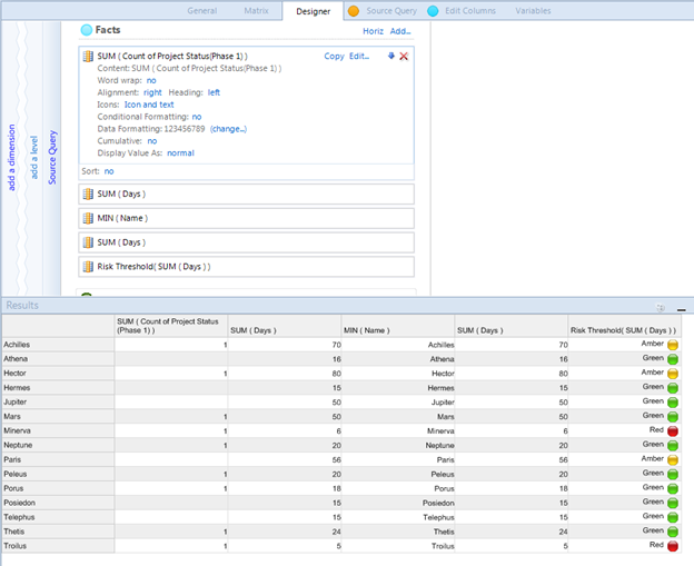
The first fact is a count of projects at Phase 1. Hence this Project Performance chart has a single segment and only those elements at Phase 1 are plotted.
2.2. Ribbon options – Refining appearance
Once you have a Project Performance chart populated with content, use the ribbon to refine its appearance and behaviour in your solution. Settings are organized across several tabs: Settings, Labels, Label (callout), Style, X Axis and Y Axis.
The following sections explain key settings that are particular to the Project Performance chart. In practice, you may have to use a degree of trial and error to get the appearance and behaviour you want.
2.2.1. The Style tab
Most of the ribbon settings that are specific to the Project Performance chart are on the Style
tab.
- Label Style has several choices. Each affects the chart’s plotting area. There is no None option. If you want to disable the labels, on the X Axis tab, in the Font group, set Text Colour to No Text.
- Colour relates to the chart’s plotting area.
- In the Chart group, the slider is enabled when State Banding Threshold is set on the panel’s flip side (Content tab). This lets you adjust the transparency of the state banding whilst the chart is visible.
- In the Markers group:
o Series Size Factor lets you adjust the size of markers based on the number of series added to the chart. The size of markers for each additional series is reduced by the specified factor. The higher the setting, the greater the size differential.
One particular use for this is with Group Markers to achieve target style overlaid markers. See below.
o Marker Scaling. If set, the Marker Size setting is taken into consideration when any conditional marker sizing is applied.
o Group Markers. If set, markers for the same elements from different series can overlay each other if their Y values match. Use this with Series Size Factor to make it clear that markers are overlaid. For example, without Group Markers, the markers for these two series are positioned at the same Y value without clashing.
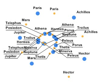
With Group Markers selected and Series Size Factor set to 2, the same chart looks like this:
- In the Palette group:
o Conditional adds the Colour field to the Select Content dialog box. When Conditional is selected, Select Fields… opens this dialog (as an alternative to using the panel’s flip side (Content tab) or when Information Shown is set to an Aggregation matrix).
o Background and Image apply to the panel’s entire area.
o Border and Border Width refer to a border around the markers.
2.2.2. Label, Line and Background settings
Here are some key points about the various label, line and background settings:
- The X axis is the periphery of each segment. The Y axis is from the centre out. So if you want to remove the default lines:
o On the Y Axis tab, in the Grid group, set Colour to No Fill. The hides the rings that radiate from the centre.
o On the X Axis tab, in the Grid group, set Colour to No Fill. This hides the lines that divide the segments.
- To hide the segment labels around the periphery of the chart, on the X Axis tab, in the
Font group, set Text Colour to No Text.
o If you want to keep the labels and find that changes to the font size are not being applied, you may need to change the Auto Fit setting in the Label group.
2.3. Using a Threshold as the Background
You can use the colours from a Threshold as banding on a chart. For example, in this chart the colours come from a Risk Threshold. This State Banding Threshold is on the panel’s flip side.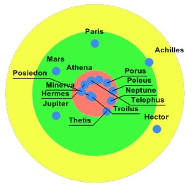
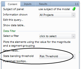
On the ribbon’s Style tab, in the Chart group, use the slider to control the colour transparency of this state banding.

If You'd like to learn more about this matter, please click the attachment.
Comments
0 comments
Please sign in to leave a comment.